Built for the Bite: How Materials, Light, and Sound Shape an Omakase Counter
The Counter as Instrument
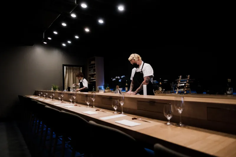
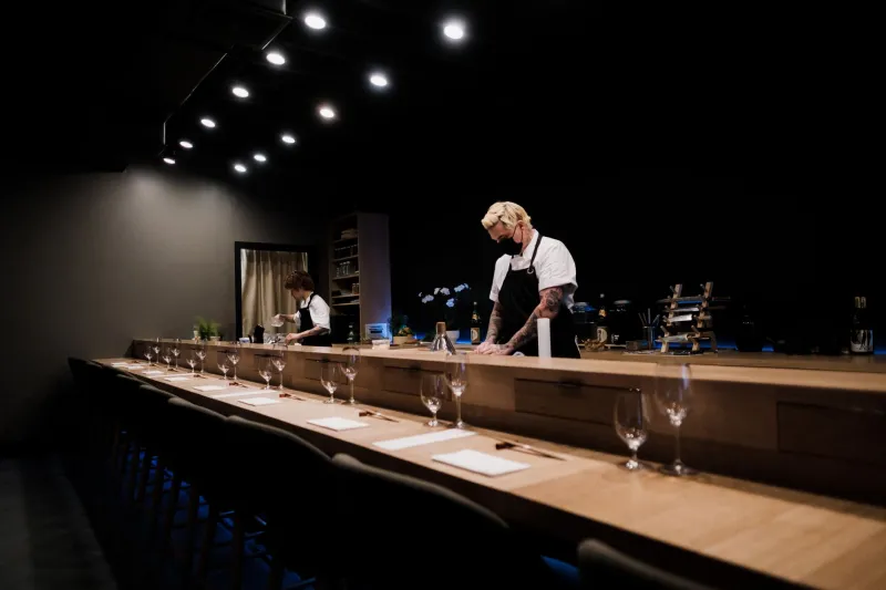
A sushi counter is often described as a stage, but that metaphor is incomplete. A stage frames a performance. A counter participates in it. The wood under the guest’s hands, the height of the seat, the color of the light, and the sound of the room all shape the way the meal is perceived. Before the first piece of nigiri is served, the counter has already begun to communicate.
At a premium omakase restaurant, design is not decoration. It is a set of decisions about attention. The counter should focus the guest without making them feel confined. It should feel clean without feeling clinical. It should support the chef’s work and disappear into the experience of eating. At Ikeda Osushi, that balance is part of the restaurant’s identity.
Hinoki and the Sense of Cleanliness
Wood is the most familiar material at a sushi counter, and hinoki is among the most respected. It is light in color, fine in grain, and naturally aromatic. It has a clean scent that many chefs associate with freshness and precision. The wood is often left unfinished or lightly treated, so it can be kept clean without losing its character.
Hinoki does more than look traditional. It sets a sensory expectation. The counter feels smooth and dry. It does not conduct heat the way stone or metal does. When a guest rests their hands on the surface, the material feels neutral and calm. That calm carries into the meal.
The choice of wood also affects maintenance and ritual. A hinoki counter must be cared for. It is wiped, dried, and respected. That care is visible to guests. It signals that the restaurant treats the counter as a working surface, not a display piece. The material becomes part of the chef’s discipline.
Light at the Temperature of Food
Lighting at a sushi counter is usually warm, but not simply for atmosphere. The color temperature of the light affects how food appears. A warm light can make fish look richer and rice look more inviting. A harsh, cool light can make even excellent ingredients look flat. The goal is not to flatter the food falsely. It is to reveal it accurately.
Direction matters as much as color. Light that falls directly on the counter can create glare and shadows. Light that is too dim can obscure the texture of a cut. A well-designed counter often uses focused, low-intensity light to illuminate the food and the chef’s hands without turning the room into a spotlight. The guest should be able to see the shine of the fish, the separate grains of rice, and the edge of the knife cut.
There is also a psychological dimension. Warm, restrained light slows the room down. It suggests intimacy and concentration. Bright, even light can feel efficient and public. At an omakase counter, the lighting should support the pace of the meal: attentive but not hurried, calm but not sleepy.
Sound as Pace
Sound is the least visible design element at a sushi counter, and one of the most powerful. A room that is too loud forces guests to lean in, raise their voices, and divide their attention. A room that is too quiet can feel stiff, as if every word is being overheard. The best counters find a middle ground: a low, steady hum that allows conversation without competing with the chef.
Acoustic design at a premium restaurant often involves soft surfaces, careful spacing, and a lack of hard, reflective angles. The goal is not silence. It is clarity. The guest should be able to hear the chef’s explanation of a piece without straining. They should be able to speak quietly without feeling exposed.
The sounds of the counter itself also matter. The tap of a knife, the soft press of rice, the brush of soy sauce, the opening of a lid: these sounds are part of the meal. In a well-designed room, they are audible but not intrusive. They create a sense of craft without turning the counter into a performance of noise.
Height, Distance, and the Handoff
Seating height is an underappreciated design decision. A counter that is too high can make the guest feel like an observer at a bar. A counter that is too low can make the chef’s work difficult to see. The ideal height places the guest at eye level with the chef’s hands and the plate, without forcing either person to lean awkwardly.
Distance matters as well. The guest should be close enough to receive a piece directly, but not so close that the chef’s workspace feels invaded. The handoff of nigiri is a small choreography. The chef places the piece on the plate or directly into the guest’s hand, and the guest receives it at the right moment. A well-proportioned counter makes that exchange feel natural.
This is why a great counter can feel different before the first piece arrives. The guest sits down and senses whether the room is calibrated. The height of the chair, the depth of the counter, the space between seats: these details tell the guest how to behave. They say: pay attention, but be at ease.
Design That Disappears
The highest compliment for a sushi counter is that it disappears. Not because it is invisible, but because it stops competing with the meal. The wood, light, and sound recede into a single impression of calm and precision. The guest notices the fish, the rice, the chef’s hands, and the rhythm of the service. The room supports those things without calling attention to itself.
At Ikeda Osushi, the counter is designed to hold that kind of attention. It is not a stage set. It is a working surface, a meeting place, and a sensory environment. Before the first bite, it has already set the terms of the experience: quiet, deliberate, and exact. The guest may not be able to name what feels different. But they can feel it. And that feeling is part of the taste.